

Choosing the right paint color can be a daunting task, but it done right it can totally transform the feel of a room.
With so many options available, it’s easy to feel overwhelmed and uncertain about where to begin
However, by following a few pro-tips and avoiding some common mistakes, you can make the process easier and ensure that the paint color you choose enhances the beauty and atmosphere of your space.
Quick links to important sections in this blog.
- Create a color scheme
- Decide on the type of paint finish
- match the color to the feeling you want in the room
- Know your whites
- Create a flow to the rooms
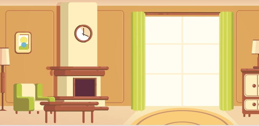
Create a Color Scheme That Matches Your Home’s Furniture
When selecting a paint color, it’s important to consider the existing furniture and decor in your space. A cohesive color scheme can tie everything together and create a visually pleasing environment. Start by identifying the dominant colors in your furniture pieces or textiles. Consider whether you want to create a complementary or contrasting color scheme.
To create a complementary scheme, choose colors that are opposite each other on the color wheel. For example, if your furniture has warm tones like reds and oranges, consider using cool tones like blues or greens on the walls. This will create a harmonious balance between the colors.
If you prefer a contrasting scheme, select colors that are adjacent to each other on the color wheel. For instance, if your furniture features shades of blue, consider using purples or greens on the walls. This will create a vibrant and dynamic atmosphere.
Remember to take into account the intensity and saturation of the colors as well. Some furniture pieces may have bold or vibrant colors, while others may have more muted tones. Harmonizing the intensity of the colors will ensure a balanced and visually appealing space.
Read More.
Decide on the Finish to Create an Appealing Visual Effect
The finish of the paint can greatly impact the overall appearance and ambiance of a room. The right finish can enhance certain architectural features or create a specific mood. Consider the following finish options and their effects:
- Matte finish: This non-reflective finish works well to hide imperfections on walls. It provides a sophisticated and modern look, but keep in mind that it may require more maintenance as it can be less resistant to stains and wear.
- Satin finish: This smooth and subtle sheen is a popular choice for walls. It offers a bit of shine and is more durable than matte. Satin finishes are easy to clean, making them suitable for high-traffic areas such as hallways and kitchens.
- Gloss finish: If you’re aiming for a dramatic effect, gloss finish is your go-to option. It reflects light and adds depth to the walls, making them stand out. Gloss finishes are commonly used on trim, doors, and furniture.
- Eggshell finish: This finish falls between matte and satin, providing a soft, velvety appearance. It offers some durability while maintaining a low sheen. Eggshell finishes are versatile and work well in most rooms.
When selecting the finish, consider the room’s purpose, lighting conditions, and desired aesthetic. For example, a glossy finish might not be ideal for a bedroom where a calm and relaxing atmosphere is desired, but it could be perfect for a modern and stylish living room.
Match the Color to the Feeling You Want in the Room
Color has the power to influence our mood and emotions, so it’s essential to choose a paint color that aligns with the atmosphere you want to create in each room. Consider the following popular colors and the feelings they evoke:
- Blue: A calming and serene color that is often associated with relaxation and tranquility. It works well in bedrooms, bathrooms, or any space where you want to create a soothing ambiance.
- Yellow: A bright and cheerful color that evokes warmth and happiness. It can be used to create an energetic and vibrant atmosphere in kitchens, dining areas, or playrooms.
- Green: A refreshing and natural color that symbolizes growth and harmony. Green is ideal for spaces where you want to bring a sense of balance and connection to the outdoors, such as living rooms or home offices.
- Gray: A versatile and neutral color that can create a sense of sophistication and elegance. It works well in various rooms and can be easily paired with other colors.
- Red: An intense and passionate color that stimulates energy and excitement. Red can be used as an accent color in spaces like dining rooms or areas where you want to create a lively and stimulating environment.
Consider the purpose of each room and the emotions you want to evoke. Choose colors that align with your desired atmosphere to create a space that feels just right.
Read More
Know Your Whites
While white may seem like a simple choice, it’s important to be aware that there are countless shades of white, each with its undertones. These undertones can greatly affect how the white appears in different lighting conditions. Some common undertones include blue, gray, yellow, and pink.
To choose the right white, consider the existing elements in your space, such as flooring, furniture, and natural light. If your space has cool-toned elements, opt for a white with blue or gray undertones. If you have warm-toned elements, choose a white with yellow or pink undertones. This will help create a harmonious and cohesive look.
It’s also advisable to test the white paint on a small area of the wall before committing to it. This will allow you to see how it interacts with the other elements in the room and how it appears in different lighting conditions throughout the day.
By understanding the undertones and testing the whites, you can select the perfect shade to achieve the desired look and feel in your space.
Create Flow in Open Plan Spaces
Open plan spaces have become increasingly popular in modern homes, and it’s essential to choose paint colors that create a sense of flow and continuity between different areas. Instead of painting each section with a different color, consider using a consistent color palette throughout the open space.
Start by selecting a base color that will serve as the main backdrop for the entire area. This color should complement the furniture and architectural features of the space. Then, choose a few accent colors that can be incorporated in different ways, such as through furniture, accessories, or smaller wall sections.
By using a cohesive color palette, you can visually connect different areas within the open plan space, making it feel unified and harmonious. This creates a sense of flow and allows the eye to move smoothly throughout the area.
Read More
What you should take out of this blog
Choosing the perfect paint color for your home doesn’t have to be an overwhelming task, and can totally transform the look and feel of any space.
Have fun with it, the biggest thing is that at the end of the day you love it!
Also, its paint, if you hate it you can simply repaint over the walls.
Consider common mistakes such as neglecting to test the paint colors, relying solely on trends, ignoring natural lighting, rushing the decision-making process, and forgetting about the importance of proper preparation and priming.
Frequently asked questions on picking paint
Q: What factors should I consider when choosing a paint color for my room?
A: Factors to consider include the room’s purpose, lighting conditions, existing decor, and the atmosphere you want to create.
Q: What are the different types of paint finishes available?
A: Common paint finishes include flat, eggshell, satin, semi-gloss, and high-gloss, each offering different levels of sheen and durability.
Q: How do I decide between warm and cool paint colors?
A: Consider the mood you want to create: warm colors (reds, yellows) evoke energy and coziness, while cool colors (blues, greens) create a calm and soothing atmosphere.
Q: What is the role of primer in the painting process?
A: Primer acts as a preparatory coat that improves paint adhesion, covers stains, and helps achieve a smooth and uniform finish.
Q: When do I need to use primer before painting?
A: Primer is necessary when painting over bare surfaces, covering dark or bold colors, or when the surface has stains or marks that need to be sealed.
Q: Can I use a primer and paint combination product instead of separate products?
A: Yes, there are paint products available that combine primer and paint in one. They can be convenient for certain projects but may require additional coats for proper coverage.
Q: What are the advantages of using latex (water-based) paint over oil-based paint?
A: Latex paint dries faster, has lower odor, is easier to clean up with water, and is more environmentally friendly compared to oil-based paint.
Q: When should I use oil-based paint instead of latex paint?
A: Oil-based paint is preferred for surfaces that require extra durability and resistance to moisture, such as trim, cabinets, or high-traffic areas.
Q: How do I test paint colors before committing to a large area?
A: Purchase sample-sized cans of the colors you’re considering and paint small areas on the walls to observe how they look in different lighting conditions.
Q: Can I paint over a dark-colored wall with a lighter paint without using primer?
A: It’s generally recommended to use primer when painting over a dark-colored wall with a lighter paint to ensure proper coverage and color accuracy.
Q: Should I use the same paint color throughout my home or vary it in different rooms?
A: It’s a personal preference. Using the same color can create a cohesive flow, while varying colors can add interest and define individual spaces.
Q: How do I prevent paint colors from looking different in different lighting conditions?
A: Test paint samples in various lighting conditions and observe them at different times of the day to get an accurate sense of how the colors will appear.
Q: Can I mix different paint colors together to create a custom shade?
A: Yes, you can mix different paint colors together to create unique shades. However, ensure you measure and record the ratios for consistent results.
Q: Do I need to paint the ceiling the same color as the walls?
A: It’s not necessary, but painting the ceiling a lighter shade than the walls can create a sense of openness and make the room appear larger.
Q: What are some paint colors that can make a small room appear larger?
A: Light and neutral colors, such as whites, creams, and pastels, can create an illusion of space and make small rooms feel more expansive.
Q: How long does paint typically take to dry?
A: Drying times vary depending on factors like paint type, temperature, humidity, and thickness of the application. Most paints dry to the touch within a few hours.
Q: Can I paint directly over wallpaper?
A: It’s generally recommended to remove wallpaper before painting for a smoother finish. However, there are specialized primers available for painting over wallpaper.
Q: Should I consider the color of my furniture and decor when choosing a paint color?
A: Yes, it’s essential to consider the existing furniture and decor to ensure the paint color complements and harmonizes with the overall aesthetic of the space.
Q: How can I create a cohesive color scheme throughout my home?
A: Select a few key colors and use variations of those colors throughout your home, ensuring they complement each other and create a harmonious flow.
Q: Can I paint over a glossy surface without sanding it?
A: It’s generally recommended to lightly sand glossy surfaces before painting to improve adhesion. However, there are specific paints available that can adhere to glossy surfaces without sanding.
Read more.